Understanding Color Psychology in Product Photography
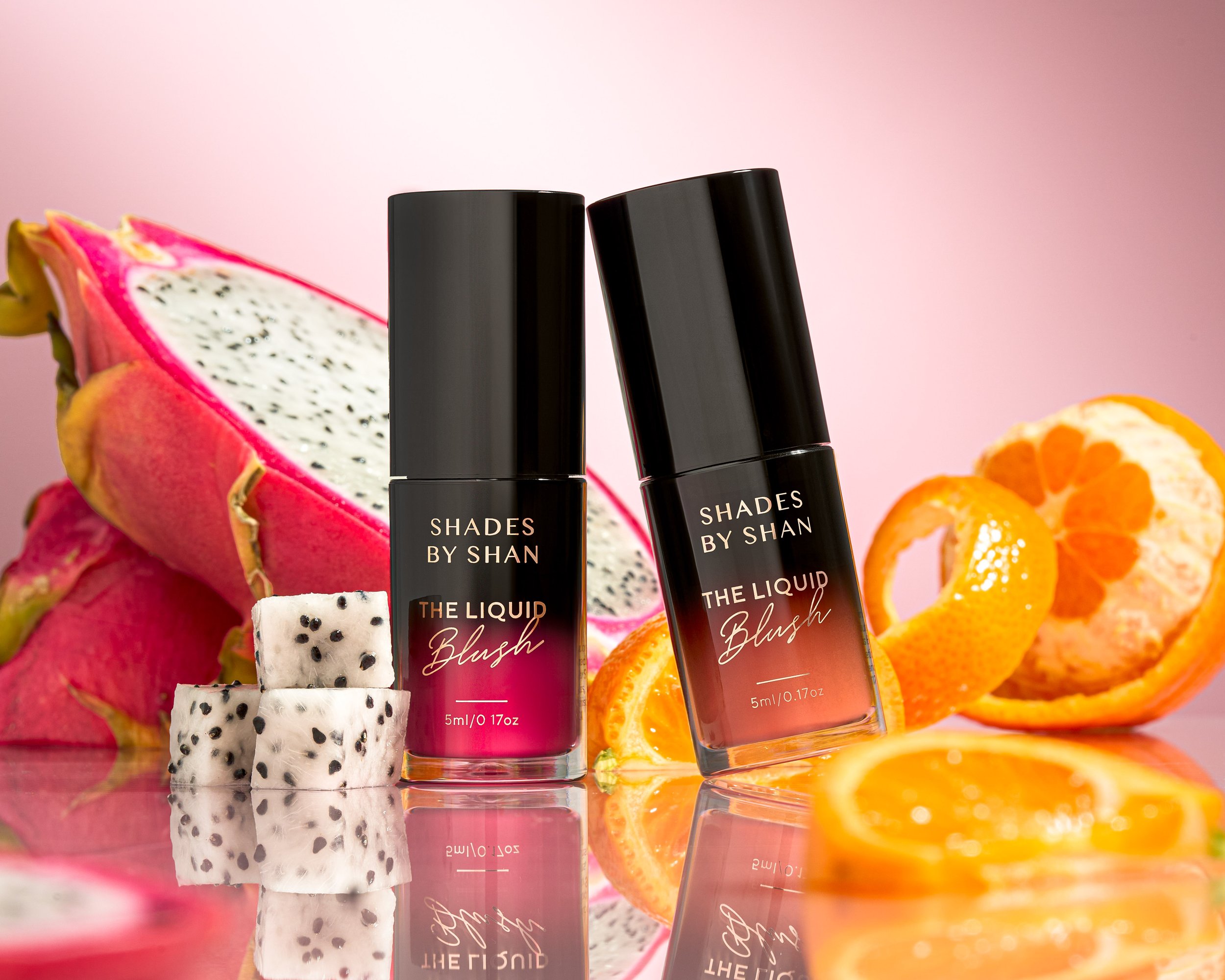
Color psychology is the study of how colors affect human behavior and emotions. In product photography, the use of specific colors can evoke certain emotions and influence customer behavior. Using warm colors like red, orange, and yellow can create a sense of excitement and energy, while cooler colors like blue and green can give a more calming and peaceful vibe. For example, a company selling outdoor gear might use green and blue tones in their product photos to convey a sense of adventure and nature, while a brand selling luxury goods might use silver and black tones to create a sense of elegance and sophistication.


Understanding Color Theory
Before diving into color psychology, it's important to have a basic understanding of color theory. The color wheel is the foundation of color theory and is made up of twelve colors that are divided into three categories: primary, secondary, and tertiary colors.
Primary colors include red, blue, and yellow and cannot be created by mixing other colors. Secondary colors are created by mixing two primary colors and include green, purple, and orange. Tertiary colors are created by mixing a primary and a secondary color and include colors like blue-green, yellow-green, and red-purple.
The Psychology of Colors
Colors have a powerful impact on human emotions and behavior. Understanding the psychology of colors is crucial in creating effective product photography. Here are some of the emotions associated with different colors:
Red: Excitement, passion, urgency, and hunger
Orange: Energy, creativity, and warmth
Yellow: Happiness, optimism, and clarity
Green: Calmness, growth, and nature
Blue: Trust, stability, and security
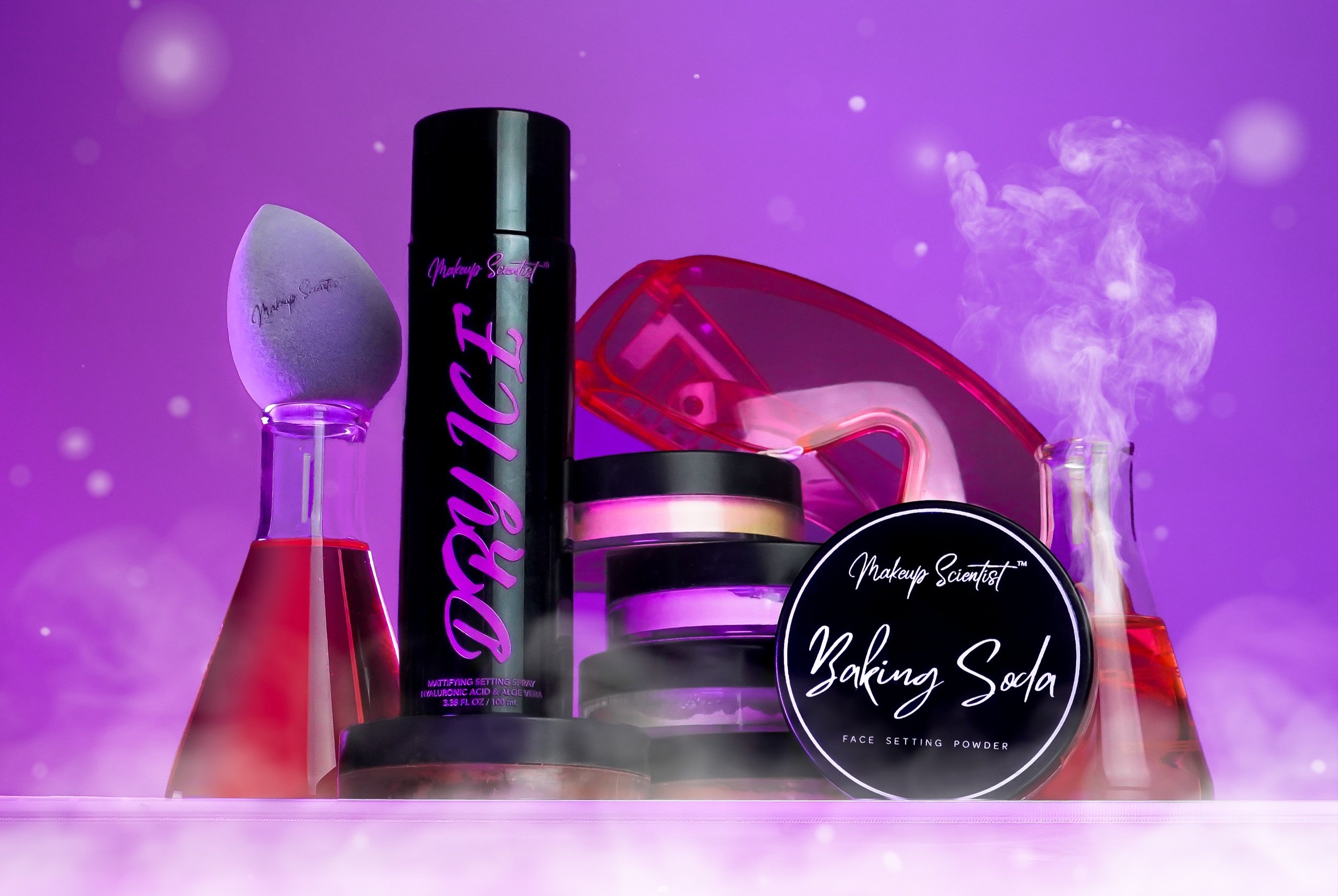
Purple: Luxury, creativity, and royalty
Pink: Romance, sweetness, and femininity
Black: Sophistication, elegance, and luxury
White: Purity, cleanliness, and simplicity
Gray: Neutrality, balance, and sophistication
Choosing the Right Colors
Choosing the right colors for your product photography involves understanding your target audience, the context in which the product will be used, and the brand’s identity. Research has shown that different colors appeal to different demographics. For example, men tend to prefer blue, green, and black, while women prefer red, purple, and yellow.
ContextContext is the most important aspect to consider when choosing the right colors for your product image. For instance, if your target audience is children, bright and playful colors like yellow, orange, and pink can attract their attention and create a sense of fun and excitement. On the other hand, if your target audience is middle-aged adults, more muted and sophisticated colors like navy, burgundy, and forest green may be more appropriate and convey a sense of professionalism and elegance. Understanding the context of your target audience and their preferences is vital to create a cohesive shoot.
Brand IdentityBrand identity is an important consideration when choosing colors for product photography. Your image colors should be consistent with the overall brand image and message. For example, if the brand is focused on sustainability and environmentalism, using green and earthy tones in your product photography would reinforce that message. Consistency in color usage across all branding materials can also help build brand recognition and loyalty. When consumers see the brand’s product pictures, they should be able to easily identify whose product it is. This can create a strong emotional connection between consumers and the brand, leading to increased customer loyalty and repeat business.
EmotionsBe sure to also consider the emotions and feelings that the colors evoke. For example, blue is often associated with trust, reliability, and calmness, making it a good choice for products that want to convey a sense of trustworthiness or dependability, such as hygiene products. On the other hand, yellow is associated with optimism, warmth, and happiness, making it a good choice for products that want to evoke positive feelings, such as children's toys or food products. By choosing colors that evoke the desired emotions, you can create a more impactful product image that resonates with the brand’s target audience
Color Harmony and Combinations
Once you have chosen the primary color for your product photography, you need to consider color harmony and combinations. Harmonious color combinations are visually appealing and create a sense of balance. There are several types of color combinations you can use:
Complementary colors: Colors that are opposite each other on the color wheel, such as red and green, blue and orange, or yellow and purple.
Analogous colors: Colors that are next to each other on the color wheel, such as blue, blue-green, and green.
Monochromatic colors: Different shades of the same color.
Triadic colors: Three colors that are evenly spaced on the color wheel, such as red, yellow, and blue.

Lighting and Color
Lighting plays a crucial role in color perception in product photography. The color temperature of the light source can affect the way the product's colors appear in the photograph. White balance is used to adjust the colors in a photograph to ensure that they appear as they would in natural light. If you feel your white balance is off, you can correct it by using a white balance card.
Editing and Enhancing Colors
Colors within a photograph can be enhanced in post-production by utilizing color correction techniques, such as saturation, brightness, and contrast adjustments. Editing tools such as Photoshop allow photographers to remove any color casts and correct any color imbalances. There is also the option to change any color in post-production should you decide another option is better. Additional color adjustment, options include tools such as selective color to enhance specific colors in the photograph or apply a color filter to the entire photograph.
Conclusion
To effectively use color psychology in product photography, it's important to understand the psychology of colors and choose the right colors that resonate with the brand’s target audience. Creating color harmony and considering lighting are also crucial steps in producing impactful images. Additionally, post-production editing can be used to fine-tune colors and enhance the overall effect. By utilizing these techniques, a product photographer can create a visual language that connects with a brand’s audience, enhances the customer experience, and reinforces the brand’s identity.
FAQs
Why is color psychology important in product photography? Color psychology is important in product photography because it helps businesses create a connection with their target audience and influence customer behavior.
How do I choose the right colors for my product photography? Choosing the right colors for your product photography involves understanding your target audience, the context in which the product will be used, and the brand’s identity.
What is color harmony? Color harmony is a visually appealing color combination that creates a sense of balance in the photograph.
How does lighting affect color perception in product photography? Lighting plays a crucial role in color perception in product photography. The color temperature of the light source can affect the way the product's colors appear in the photograph.
What are some common color correction techniques used in Photoshop post-production editing? Some common color correction techniques used in post-production editing include adjusting saturation, brightness, and contrast.